
When trying to do research in the realm of communication or sociology, it often helps to be able to visualize data connections and similarities. Gephi software allows you to visualize data that would otherwise be very hard to analyze without an image. This software essentially functions like Excel and Photoshop as it allows you to input a data set and then customize your graphic in many different ways. There are many other social graph producing programs out there, but Gephi definitely allows you to apply the most customization to your graphics. I do not have too much experience with this kind of software, but in the little time I have played around with Giphi, it is clear that there is a lot that can be done with this program. Although there is a bit of a learning curve to it, it really produces some unbelievable products.
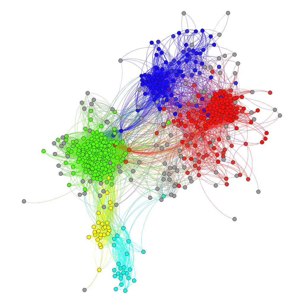
My social network as seen above has many separate groups but still is relatively uniform. The colors represent my communities of friends over the years on Facebook. The green color represents my college community while the red and blue represent my high school years. The yellow and light blue are comprised mainly of two different summers while in college. The groupings of nodes are positioned by the amount of time I have been friends with that person on Facebook. In my network, I see 2 main groupings of clusters that seem to be subdivided into 2 separate groups from there.
The most interesting conclusion I reached during this analysis was that I have met many people over each of my summers here college. This I knew of course, but to actually visualize gives it a whole other meaning. In addition, I am able to find my high school classmates that came to Purdue by finding the nodes that have many connections between the green and blues/reds. A bit of a simple conclusion would be that I have met more people in college than ever before according to my social graph.
Playing around with this software is exceptionally enjoyable. You see these kinds of graphs on Buzzfeeds, Twitter and Facebook all the time and to actually learn how to make them is pretty cool. It is also clear that these graphs can be seriously used to diagnose research in many different professions. Obviously being most applicable to social networking and societal research, I think this software can also be used heavily in statistical research. With this software, you can take your entire population and see its distribution. Let’s say you were looking at a population of people’s favorite vegetable. Gephi can do an excellent job in dividing up the data to show visually what people may prefer. Though that is a simple example, there are many applications of decision based statistical analyses that you could do with this program. I would recommend this program to anyone simply looking to visualize data.
